Rachel
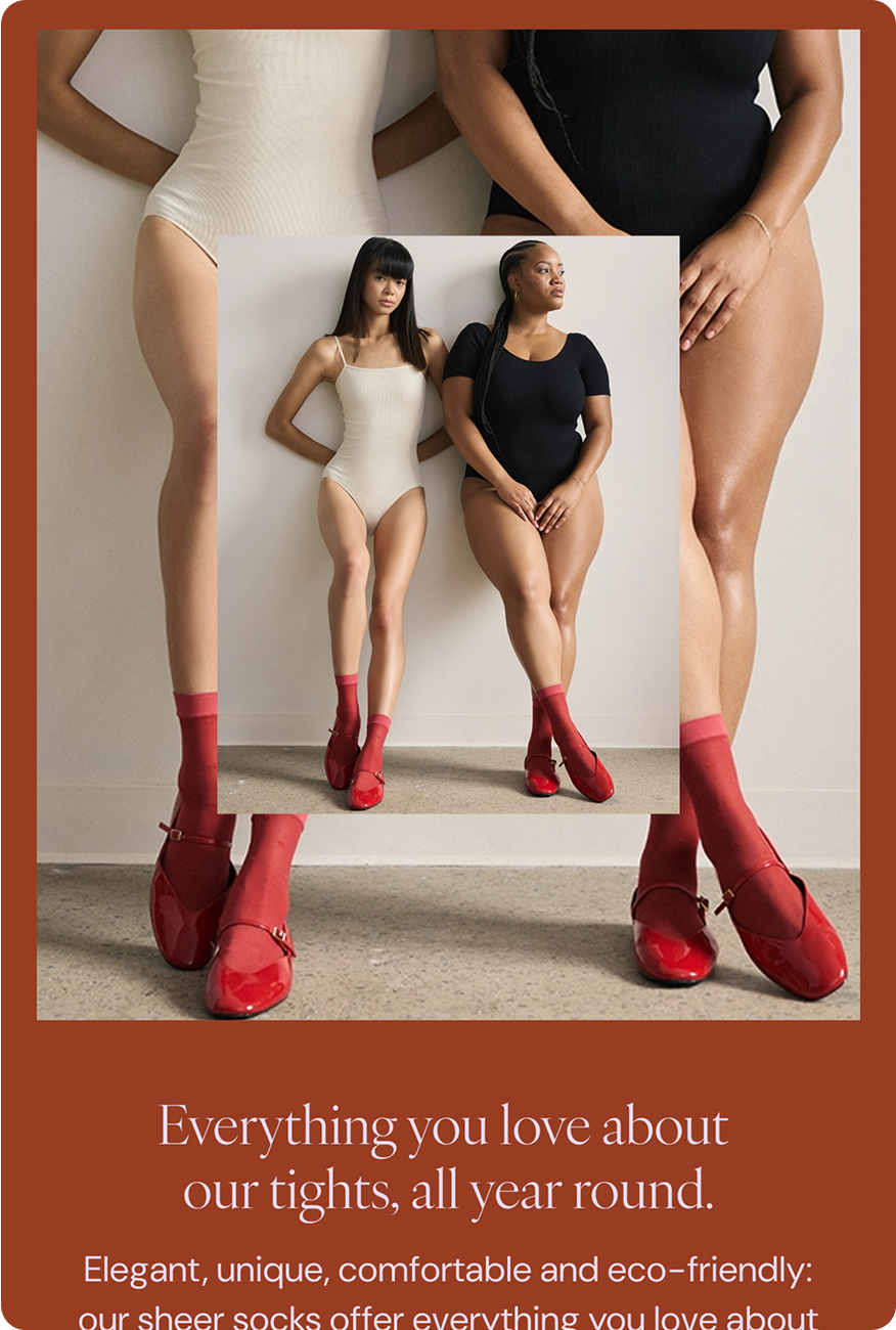
Eco-conscious first-layers.

Brief
Rachel partnered with us to thoughtfully mature their brand identity, aligning their visual language with the brand’s evolving personality and vision. We approached the project as a careful, phased rollout — updating colours, typography, logo lockups, patterns, packaging, and the website — to ensure consistency while allowing the brand to grow naturally. The result is a cohesive, confident, and flexible identity that supports Rachel’s long-term growth and stronger connection with their audience.
Menu Items

Our Approach
We worked closely with the Rachel team to guide a phased, intentional evolution of the brand, balancing growth with audience familiarity.
We developed comprehensive brand, social, and photographic guidelines, enabling the team to express the refreshed identity confidently across all touchpoints, ensuring a seamless and thoughtful rollout.


The Logo
We modernized Rachel’s logo to reflect the brand’s maturity, creating a versatile and confident identity.
The icon — an intertwined “R + A” — balances geometric structure with subtle curves, introducing movement and warmth while remaining precise and intentional. Layered and thoughtfully designed, it gives the brand a distinctive, memorable mark that works across applications.
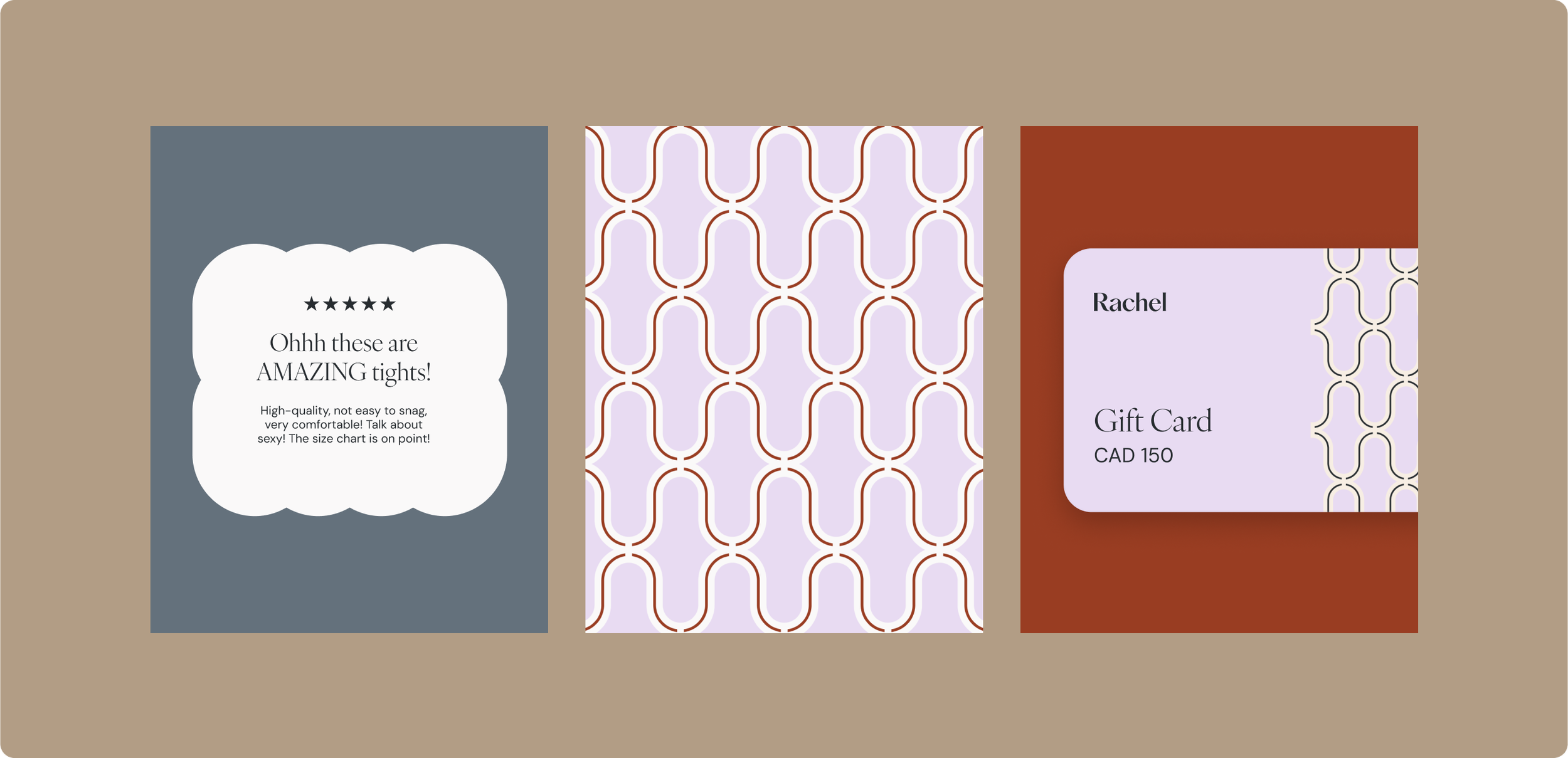

The Colour Palette & Illustrations
Rachel’s updated palette balances maturity and energy — grounded blues and neutrals provide stability, while accents of rust and lilac introduce vibrancy and distinction. To extend this visual language, we created a system of layered illustrations derived from the brand icon itself. These geometric yet delicate forms can be combined, overlapped, or paired with photography, subtly evoking the idea of “first layers” while bringing warmth, depth, and flexibility to the identity.


Emails
Using Rachel’s refreshed brand identity, we crafted a modular email system — from the Welcome Flow to ongoing campaigns — that balances flexibility with consistency. Each template is designed to be on-brand, engaging, and adaptable, ensuring every subscriber touchpoint reflects the warmth, personality, and sophistication of the Rachel brand.

The campaign identity was anchored in a flexible grid system inspired by Ergonofis’ transparency and craftsmanship. This grid became the foundation for all creative, allowing assets to feel structured while still adaptable.
Building on this, we developed layered wood textures that celebrated the natural variations in material — reinforcing the brand’s dedication to quality and care.
Next serving: Ergonofis
