Ergonofis
Premium standing desks.
Brief
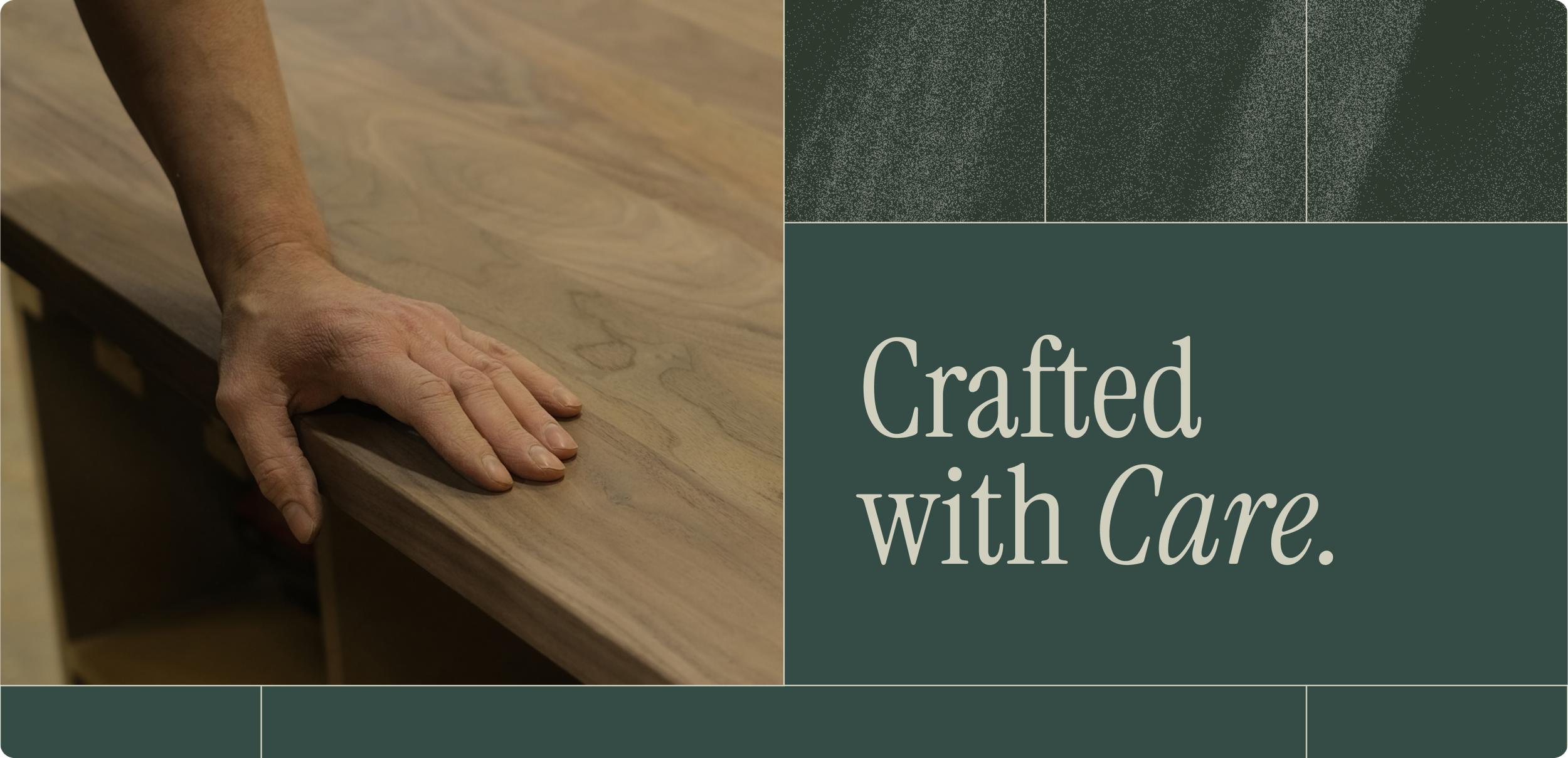
Ergonofis approached us to develop a visual identity for their Black Friday campaign, centred around the concept, “Built to Last, Crafted with Care.”
We took this foundational idea and expanded on it, creating a cohesive campaign that emphasized the brand’s values of quality, durability, and craftsmanship while standing out in the competitive Black Friday landscape.
The result was a Black Friday campaign layered with storytelling, that effectively captured the attention of consumers while staying true to Ergonofis’ premium brand identity and values.
Menu Items


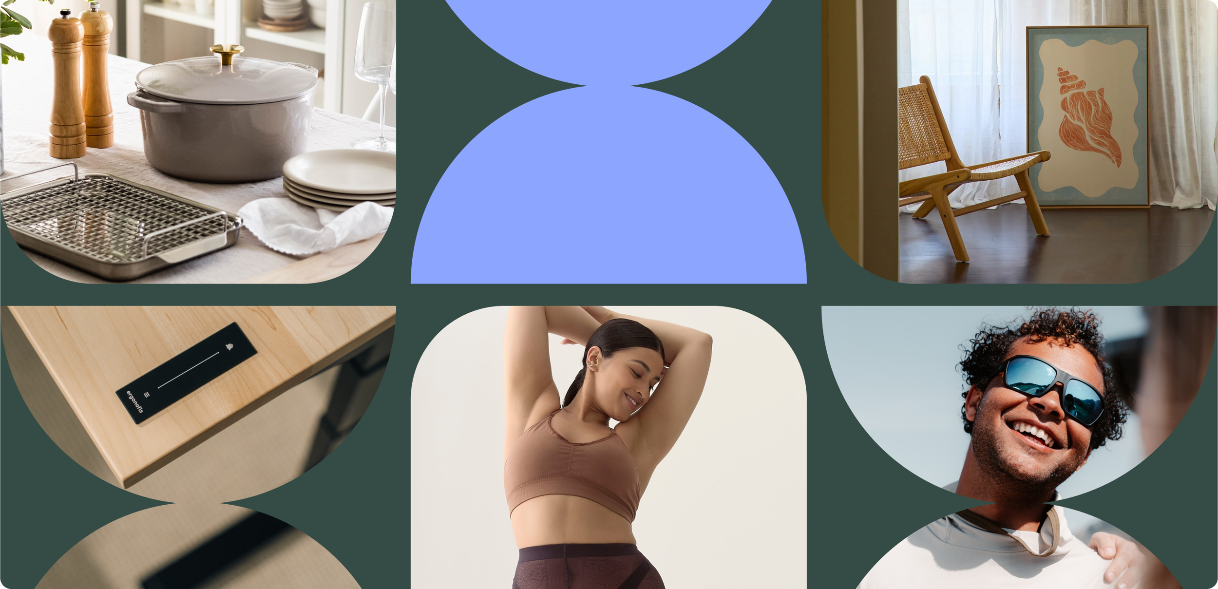
Campaign Elements
The campaign identity was anchored in a flexible grid system inspired by Ergonofis’ transparency and craftsmanship. This grid became the foundation for all creative, allowing assets to feel structured while still adaptable.
Building on this, we developed layered wood textures that celebrated the natural variations in material — reinforcing the brand’s dedication to quality and care.
The colour palette centred on deep green, complemented by a fresh light blue to stand out in the crowded Black Friday landscape and nod to Ergonofis’ sustainable ethos. Typography paired the warmth of Instrument Serif with the precision of Graphik, blending handcrafted authenticity with modern clarity.


Campaign Visuals
We crafted a series of storytelling-led visuals to bring the campaign theme, “Built to Last, Crafted with Care,” to life. These pieces leaned into depth, layering, and texture to highlight Ergonofis’ values of durability and design excellence, providing the backbone of a sustained, premium campaign identity.


Promo Visuals
To drive urgency and attention, we developed brighter, more promotional creative that still felt elevated within the Ergonofis world. These visuals used bolder applications of colour and grid treatments, ensuring the campaign could flex into a competitive Black Friday environment without losing brand integrity.


Educational Visuals
Education was a key pillar of the campaign. We designed modular carousel templates to break down messaging into approachable, visually engaging stories — showcasing process, materials, and product benefits in a way that built consumer understanding while reinforcing Ergonofis’ expertise.
Repositioning Nolk as a consumer-facing endorser brand meant solving a unique challenge: their identity had to stretch across nine diverse brands while remaining strong enough to stand beside fintech leaders.
We needed something credible, playful, and versatile — serious enough to inspire investor confidence, but flexible enough to resonate with conscious consumers and brand owners.
Next serving: Nolk