Nolk
Collective of purpose-driven brands.

Brief
Our task was to reposition Nolk from a behind-the-scenes, investment-focused holding company to a consumer-facing endorser brand. This required balancing the playful spirit that Nolk already embodied with an elevated, functional, and versatile branding system.
The new brand identity needed to resonate with three distinct audiences:
Conscious Consumers who value authenticity and purpose-driven businesses.
Thoughtful Brand Owners seeking a trusted partner to grow their brands.
Investors who require clarity, professionalism, and a strong sense of credibility.
To meet these demands, the branding strikes a balance between clean and confident for a fintech-level presence while avoiding a dry or overly corporate feel.
The result is a strong yet approachable identity that softens for consumers but holds its own alongside other leading fintech companies.
Menu Items


Our Approach
Repositioning Nolk as a consumer-facing endorser brand meant solving a unique challenge: their identity had to stretch across nine diverse brands while remaining strong enough to stand beside fintech leaders.
We needed something credible, playful, and versatile — serious enough to inspire investor confidence, but flexible enough to resonate with conscious consumers and brand owners.
Through extensive research, including a cross-brand consumer incubator, we identified Designed to Last as the unifying idea. It connected every brand in their portfolio and resonated with customers and stakeholders alike.
From there, we developed messaging frameworks for each brand that laddered up to Nolk’s positioning while preserving their individuality. At the core, shared pillars ensured a common thread, giving coherence to the collective without compromising uniqueness.


The Colour Palette
The colour system needed to echo sustainability, versatility, and play. We built around three hues of green to ground the identity in nature and purpose. A neutral beige added balance and clarity, while accents of lilac, yellow, and blue brought in vibrancy and a sense of optimism. The result is a flexible palette that adapts: professional and grounded when needed, bold and playful when dialed up.


Illustrations & Patterns
Illustration had been part of Nolk’s DNA, and we wanted to elevate that legacy rather than abandon it. We designed a system of shapes and illustrations with intention — each representing a core value or pillar of the brand.
They could live on their own as meaningful icons, form patterns and textures, or inject a sense of playfulness into otherwise clean layouts. In this way, the illustrations became more than decoration: they became a language of purpose.


The Website
The website had to do it all: attract investors, engage consumers, and build trust with brand owners. Our solution was a structure that balanced clarity with warmth. Serious enough to stand alongside fintech peers, the site used colour and illustration to soften its edges and invite engagement.
Every page was designed not just to inform, but to tell stories that connect their audiences to the values driving Nolk forward.


Email became the engine for cross-brand discovery. We built modular stories around “designed to last,” then placed them where they matter most—brand welcomes, post-purchase flows, and seasonal campaigns.
Content leaned heavy into storytelling with useful content and gentle pathways to explore fellow Nolk brand. We created shared segments and brand clusters so recommendations felt relevant, not random.
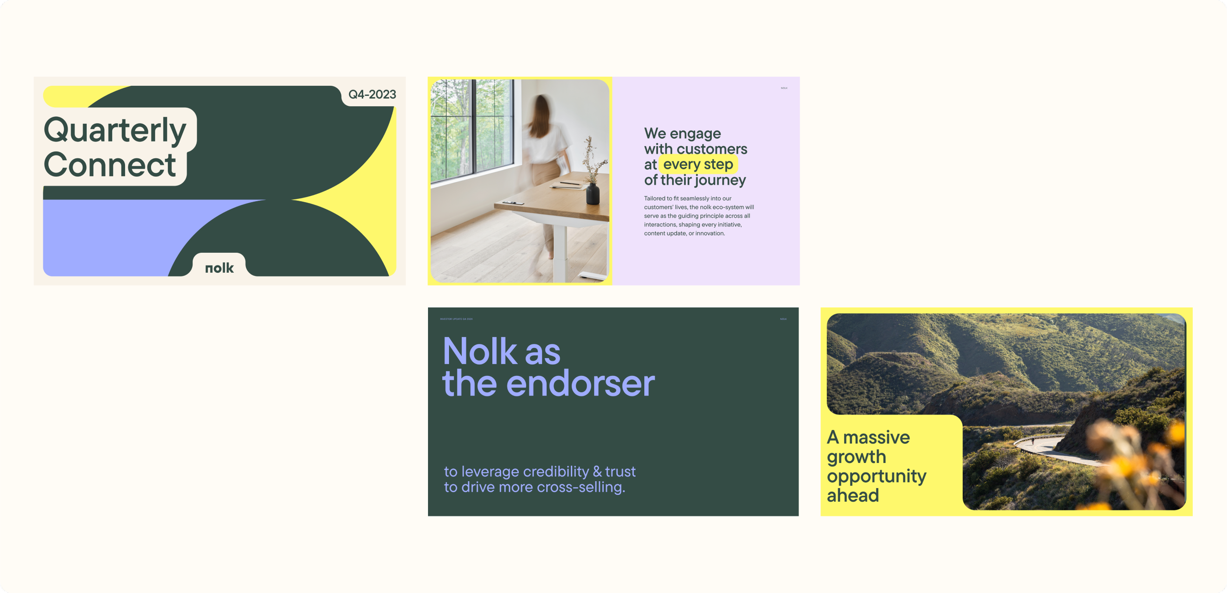
Decks
We developed a suite of decks tailored to Nolk’s audiences—including investor updates, internal communication, and external partnership decks—each designed to reinforce the new brand positioning through clear storytelling and consistent design.
To support autonomy and scalability, we also created Google Slides templates, enabling team members to build on-brand presentations with ease.

The Results
Repositioning Nolk as an endorser brand created clarity across the portfolio, strengthening both external storytelling and internal alignment.
The refreshed identity and website invited investors, partners, and consumers into a consistent narrative, while highlighting the distinct strengths of each brand.
Email then became the engine that brought this ecosystem to life—designed not just to communicate, but to connect.
By weaving storytelling into modular campaigns and embedding cross-brand pathways into flows, we shifted behaviour from siloed brand engagement to portfolio-wide discovery.
This approach grew cross-brand affinity from 0.5% to 10%, proving that thoughtful brand architecture paired with narrative-driven communication drives measurable impact.
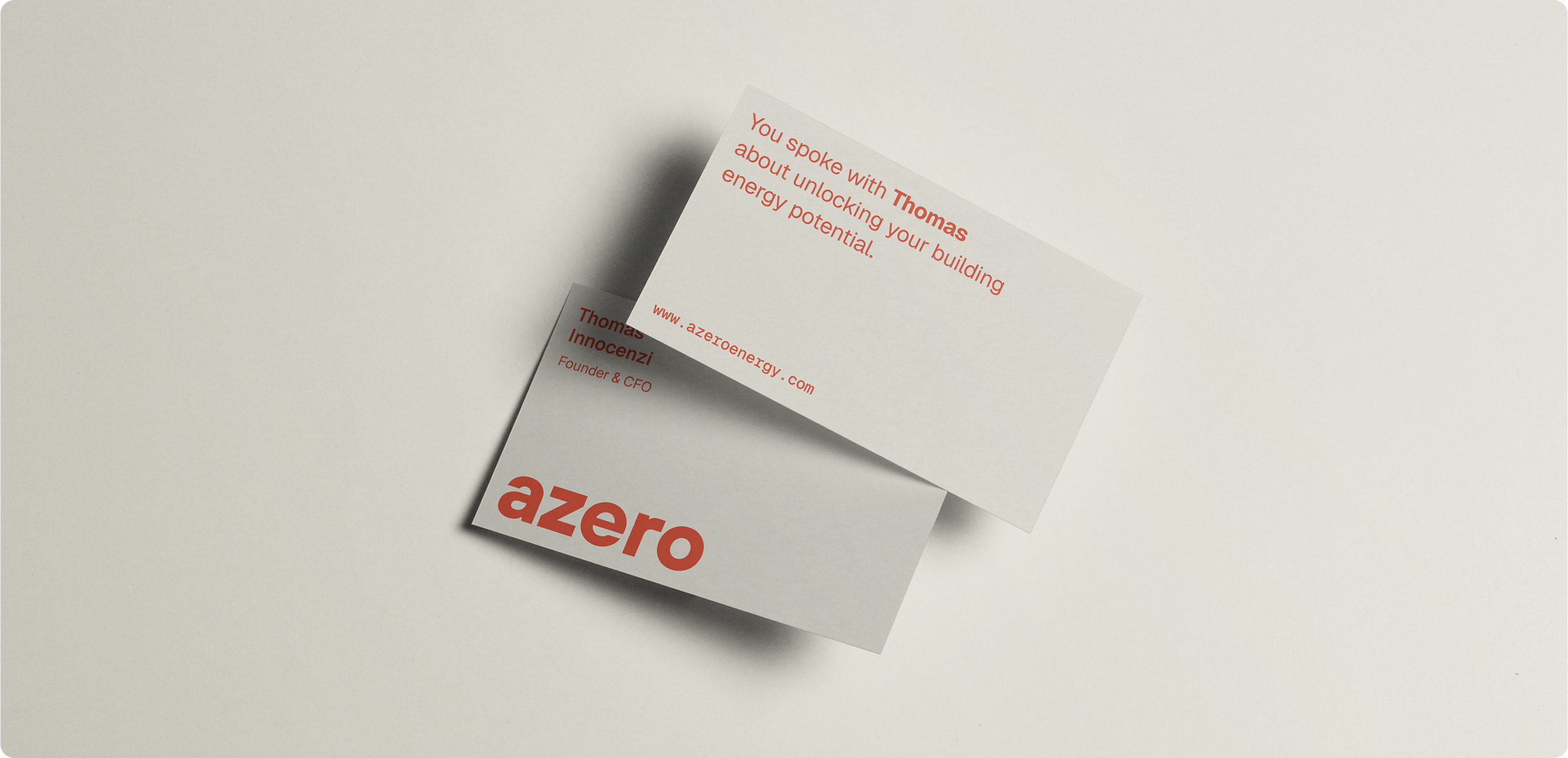
Azero came to us with an ambitious vision: to build a brand that could lead in the energy transition space while speaking clearly to investors, building owners, and future partners.The challenge was to distill a technically complex offering into a brand identity that felt accessible, confident, and scalable.
Next serving: Azero