
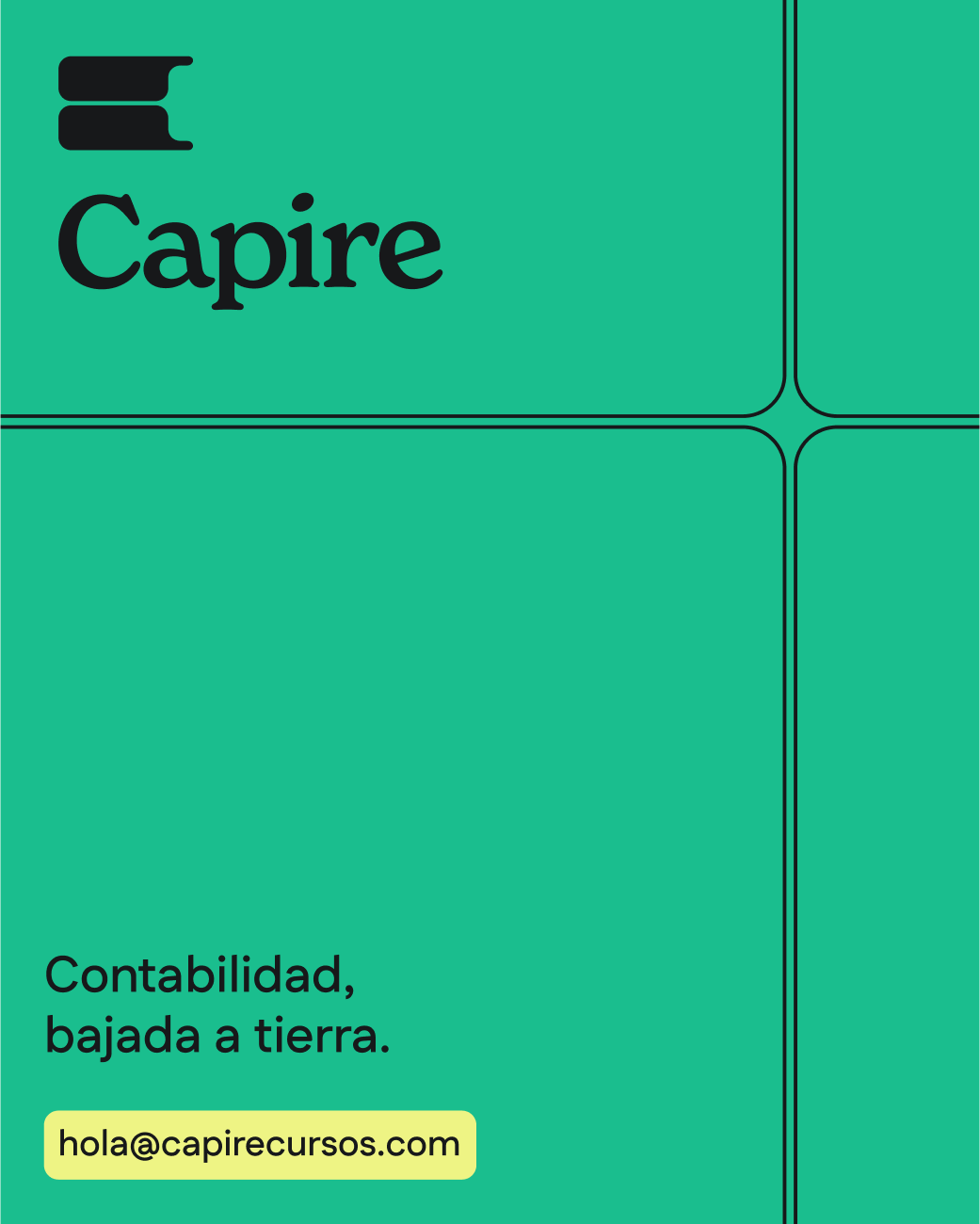
Capire
Accountancy training.
Brief
Our goal was to build a brand for Capire that feels approachable, warm, and human while retaining the professionalism and authority needed to build trust. Traditional accounting materials are dry, rigid, and inaccessible. Capire needed a brand that reflects the founders unique teaching style: clear, practical, anecdotal, and engaging.
The result is an identity that bridges two worlds: the seriousness of accounting with the playfulness of learning. From strategy to design, every element was crafted to help people feel less intimidated by numbers and more empowered to understand them.
Menu Items

Our Approach
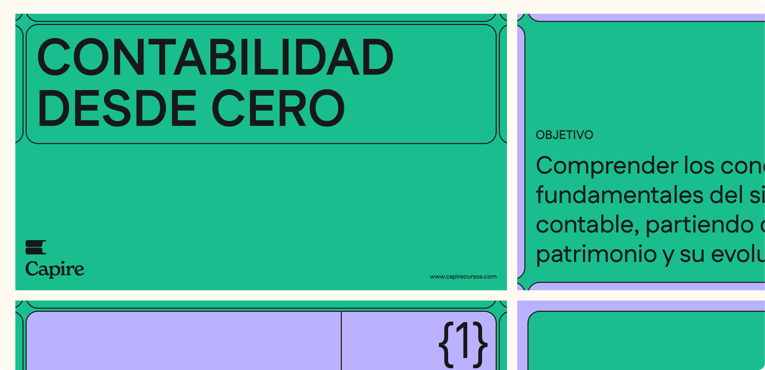
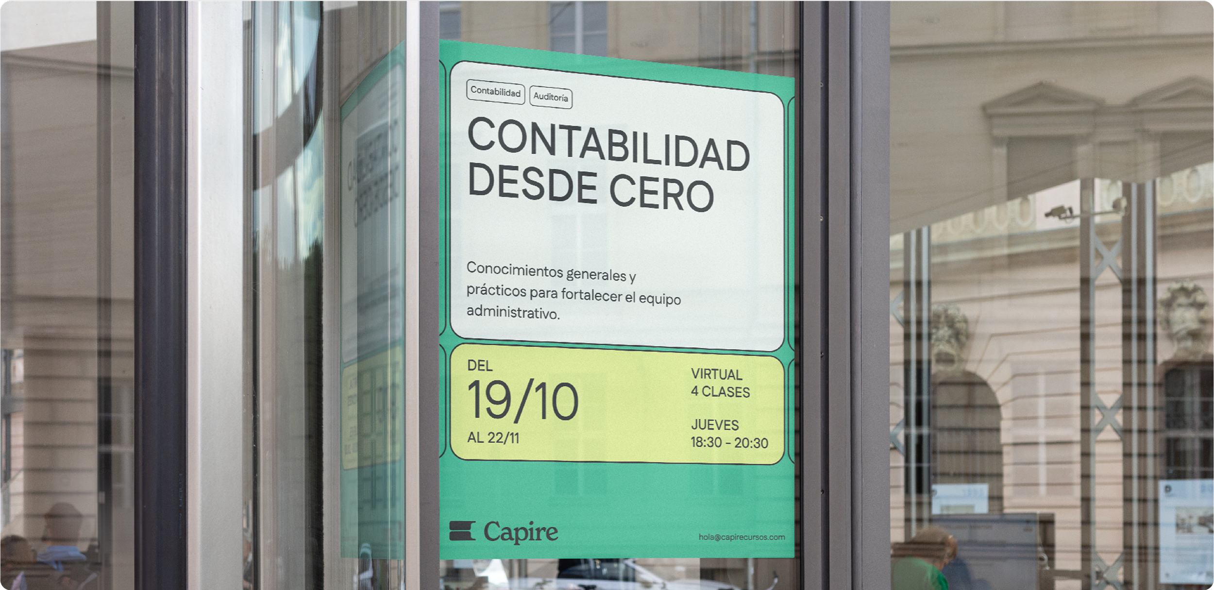
We anchored Capire in the idea of bringing accounting down to earth. The brand system was designed to mirror the founders teaching: clear, structured, and professional, but always with warmth, relatability, and a touch of fun.
Oversized headers and bold numbers cut through the noise, echoing the way Capire simplifies complex concepts into digestible insights. A playful but grounded colour palette sets Capire apart from the rigid, muted tones of the industry. The result is a brand that empowers learners to connect the dots with confidence.
The Logo
The Capire wordmark balances elegance with approachability. Subtle irregularities in the letterforms lend it an organic, editorial feel, while the contrast between fine and bold strokes gives it both delicacy and strength. The logo captures the essence of the brand: professional and trustworthy, but never stiff.
Built from cells — the fundamental building blocks of spreadsheets — the icon subtly forms the letter “C.” This shape also evokes a key, symbolizing understanding, unlocking knowledge, and connecting ideas. Like the brand itself, it lives in the space between technical precision and human clarity.


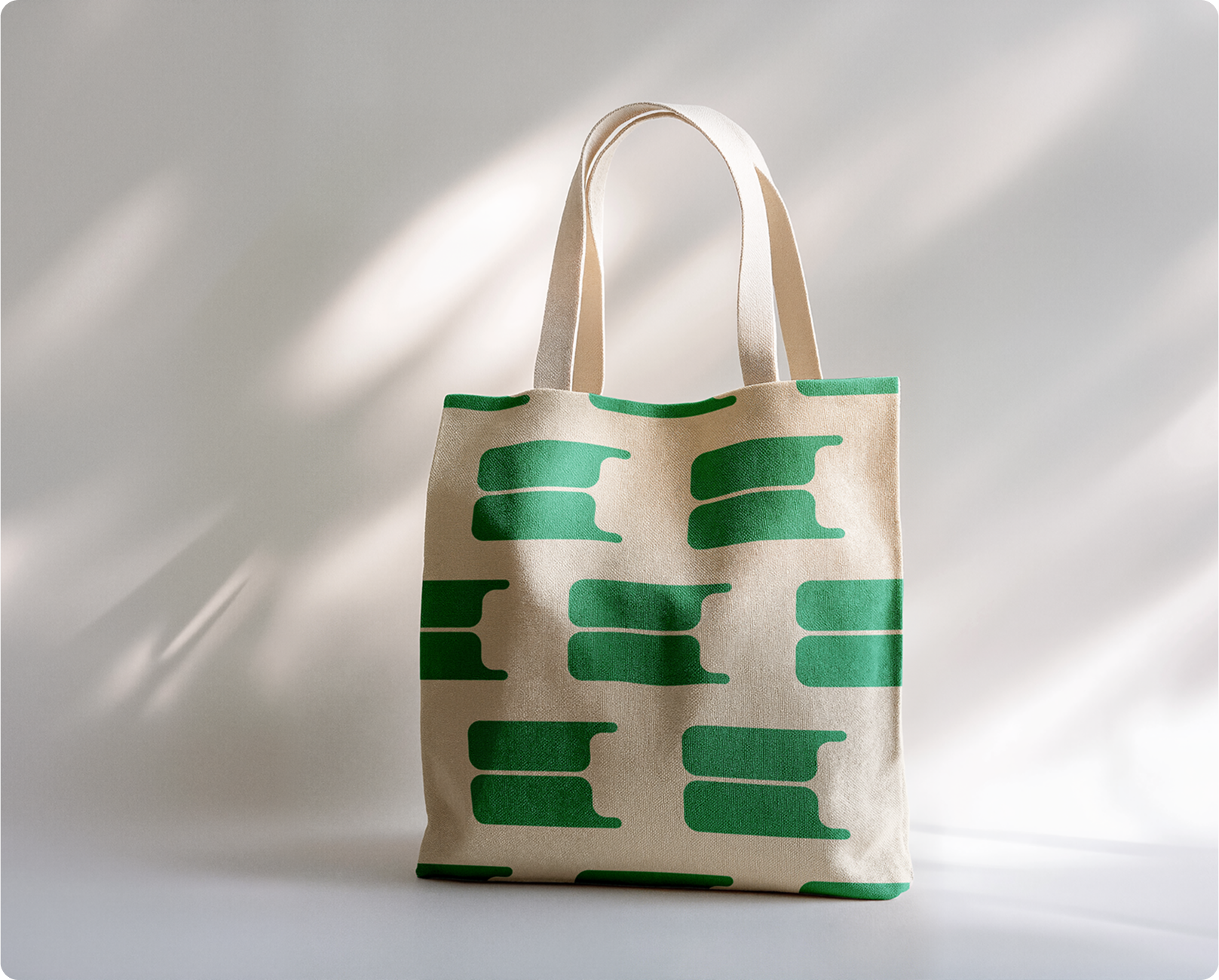
The Colour Palette
Fun and playful, yet grounded and professional. The palette was designed to stand out in a sea of corporate blues and greys, signalling that Capire’s classes are anything but boring. Bright but balanced tones create energy and approachability while maintaining the credibility essential to the world of finance.


The Brand System
From a single cell, an entire graphic world unfolds, replacing the need for illustrations. Rooted in the structure of a spreadsheet, we bridge accounting and design, creating a flexible system that adapts to unique layouts and brand elements.
We modernized Rachel’s logo to reflect the brand’s maturity, creating a versatile and confident identity.
The icon — an intertwined “R + A” — balances geometric structure with subtle curves, introducing movement and warmth while remaining precise and intentional.
Next serving: Rachel
